

Redesigned iOS 15 Icons – Interview With The Designer
With iOS 15 coming in the fall we have a great redesign of the classic iOS icons. The last big iteration happened a few years ago and we’re waiting for what Apple might bring to the table with iOS 15. Here’s a great idea for iOS 15 icons.
There have been some leaks pointing to the potential new redesigns for some icons like App Store and Apple Music. With the introduction of iOS 15 Beta 2, Apple has redesigned the Apple Maps icon. Currently, there’s no indication we will get a new set of iOS icons with the iOS 15.
Apple Maps has a new icon:
— Francesco Palmieri (@francescop147) June 24, 2021
iOS 15 beta 1. iOS 15 beta 2 pic.twitter.com/ptQEYm3DUq
Check out Best Wallpaper From Apple Park.
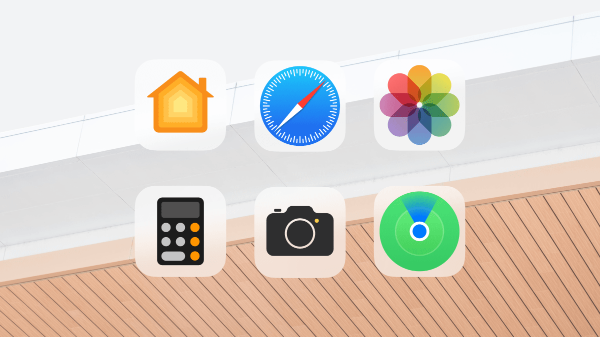
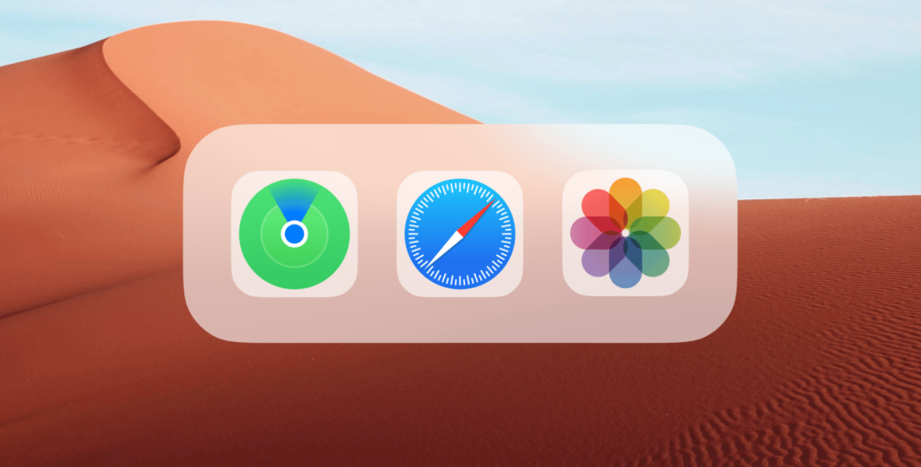
Vinoth Ragunathan put the matter in his own hands. He designed an iOS icon concept that has a translucent effect instead of a solid white. The translucent effect also has some blur properties to better work with the wallpaper.
Okay, hear me out: transparent app icon backgrounds instead of plain and boring white 🤍 pic.twitter.com/ULT8gNZxQR
— ˗ˏˋ Vinoth Ragunathan ˊˎ˗ (@helvetiica) July 14, 2021
I’ve asked Vinoth for some comments about his design. Enjoy the interview.
In your opinion what is better with your version of the iOS icons compared to the original?
Vinoth: I believe white backgrounds on app icons are dull, boring, and lazy — they lack characteristics. So, having your wallpaper shine through an already empty canvas will give a sense of personality not just for the icons but for your home screen as well.
How would the blur background of an icon work on the already blurred dock?
V: Simple. It’ll be lighter with a hint of your wallpaper — iOS transparency is only 60% so, it wouldn’t be a problem.
What was the design process behind this project?
V: Legibility is fundamental, not just in typography but in design as well. If you have a page full of apps on white canvas, it’ll be hard to differentiate at first glance due to high contrast. In this case, transparency will play a key role by using the colors of your wallpaper for visual hierarchy in a sea of apps.
Do you think such design could be seen in the future iOS version?
V: Design trends change every so often it’s hard to predict what iOS will look like in a few years. But if I had to guess a “design trend,” I’d say Apple would want icons to adapt to system theming in the future — Eg: icons will change to a darker color palette when in Dark Mode.
Again I would like to thank Vinoth for taking the time. He is such an amazing designer and a great internet friend. We’ve met on Google+ years ago and I’ve been his fan ever since. Make sure to check out his Twitter for more amazing content like this.
If you want more posts like this, make sure to follow Zheano Letter. I send out one newsletter per month filled with awesome content. Follow Zheano Letter for free.