KAAIP Adaptive Icon Pack

When it comes to icon pack developers, I try to be as supported as I can since I know how much hard work and talent goes into making one. This is a review of KAAIP, a brand new icon pack designed by 221 Pixels. Earlier this year we saw Relevo icon pack from them that I also wrote about. Here’s my review of Relevo. The guy behind 221 Pixels is Kevin Aguilar, an extremely talented guy. With his recent projects, I can’t wait what he has for us in the future.
You might not remember, but a while ago Kevin released material designed icon pack called KAIP, which was unpublished from the Google Play Store. Interesting name choice, right? Well, we might lose KAIP forever, but we got something exciting KAAIP is here, fresh and ready for you.
Brother Of KAIP
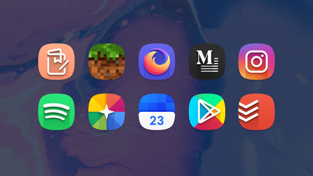
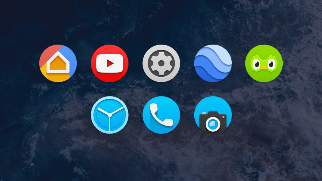
If you don’t remember how KAIP looked don’t worry, it was a clean material icon pack, and KAAIP is like his brother. They’re very similar in some ways but a complete opposite in others. One of the most stands out features is a deviation from material guidelines when it comes to KAAIP, but that’s not a bad thing. Icons look modern and a bit harsh at times with its hard down forward shadow. The shadow makes some icons stand more than others. From time to time, it feels a bit off; however, if you’re ready to play with it for a while, you can find some great replacements to make your home screen look coherent.
Adaptive Element

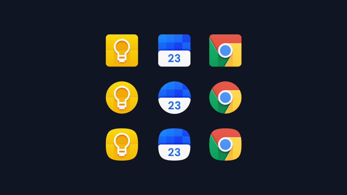
When you go to the icon pack and tap on the Apply section, the list of launcher available is short if you compare it to some other icon packs. That’s because of the adaptive element. KAAIP icons are built with adaptive style in mind, which means that you can use any shape you want, and they will still look beautiful. I personally love this feature, and I’ve been waiting for this kind of icon packs for quite some time. I got some hope with Relevo, but those were 3 different icon packs. This is one icon pack, and you can tweak the icons’ shape within the launcher settings.
Currently, only Lawnchair, Action, Apex, Nova and Smart launcher are supporting this feature. The list is a bit extended in the description of the app on the Google Play Store. I’m not going to test with every single launcher if it works or not. If you already use one of these launchers you’re good to go. I personally use Lawnchair, and I love how I can just change icon shape, and the icon pack is compatible with the change. It’s the first adaptive material designed icon pack I’ve used, and it’s great.
Design, Hit Or Miss
Before I say more great things about this icon pack here are some that bother me. The light blue color for “stock” icons doesn’t work. Default Phone and SMS Google apps use some variant of indigo blue, and I like that color a lot. I wouldn’t complain as much if I could pick any alternative colors. I’m sure that the developer will add more colors to choose from in the future updates.

There are also some inconsistencies when it comes to shadows, and because of it, the icon pack sometimes doesn’t feel like a whole. For example, even in preview screenshots, some icons, Slack for example, doesn’t have a typical shadow. I haven’t talked with the developer about this, and it could be just a part of the design. It doesn’t bother me; however, it’s something I’ve noticed.
Content Rich
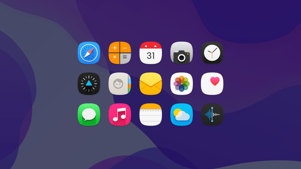
KAAIP has more than 700 themed apps, that’s a lot for a newly released icon pack, and we will get even more icons with future updates. There are also some generic folders with two different styles, and iPhone inspired icons that look quite good. Icon pack currently doesn’t include any wallpapers; however, the icons will work best with darker wallpapers. You can find some here on Zheano Blog. For the price of 1,50€ it’s a good deal. Is it for everyone? No, you need to use one of the recommended launchers to get the adaptive element out of it. The style is a bit different than usual, but that’s good. Check out the screenshots and see if you like the icons if you do there’s no reason not to get it.

If you want to recreate the iOS look on your Android smartphone you can also try using our iOS 13 wallpapers. You can find them here.
Conclusion
Original KAIP has been receiving updates for over 4 years so I’m sure KAAIP won’t be any different. What I’m trying to say that if you like the style of the icons, KAAIP is a good investment. I’ve been using KAAIP for a few weeks now as a closed beta tester, and the icons have grown on me overtime. I’m pleased to write about icon packs from such talented designers like Kevin. Get KAAIP on the Google Play Store.
I’m glad that I can “help” the community in my own way. I have quite a few icon packs I want to review in the future, and I hope these reviews are interesting to you. Let me know what do you think about this icon pack, it means a lot to hear something from you.
Looking for more recommendations of icon packs, wallpapers and more? Be a part of Zheano Family and join Zheano Letter. You can do so for free and your data is safe with us. We only send a new newsletter once every couple of weeks. In the newsletters you can find everything from app recommendations to Zheano Letter exclusive wallpapers. Subscribe today for free and become a part of Zheano Letter.

